Comparing Crop Efficiency
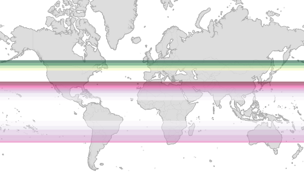
“Energy capture” is a measure of the amount of energy per hectare produced by a crop. Using this measure to compare the energy efficiency of corn and sugar cane, we can see how each has evolved to grow at different latitudes. Sugar cane (pink) is more efficient in equatorial regions, whereas corn (green) has evolved to grow more efficiently further north.
Exploring Energy Capture
To explore and illustrate the relationship between latitude and the energy capture of these two crops I built a simple visualization that juxtaposes a map with a scatterplot showing energy capture vs. latitude.
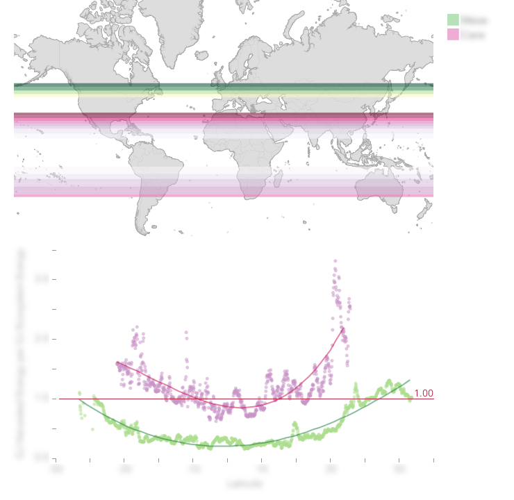
The map uses colored bands to indicate the amount of energy capture for each crop at different latitudes. Each crop is differentiated by hue (corn: yellow-green, sugar cane: pink-magenta). Higher energy captures are presented as darker colors.
Below the map, a scatterplot shows the data points from which the map was generated. The red line represents a minimum threshold of energy capture, below which data is not shown on the map. Thus, users can set a minimum energy capture for crops on the map to see how that affects where in the world those crops could be grown.